There are a number of factors that determine whether or not a website visitor converts into a lead. The visitor’s awareness of your brand is one. The value the visitor finds in your offer is another. But the landing page is often the area where marketers can make the most difference in the outcome of a campaign. Why?
- Most marketers have control over their landing pages. Unlike the level of brand awareness, most marketing teams today can quickly create their landing pages. Brand building, on the other hand, takes time.
- If their landing page is getting traffic, but visitors aren’t converting, marketers can optimize their landing pages in an effort to improve performance. The ability to A/B test landing pages will demonstrate how changes to the design, the message, or the offer affect the results of the campaign.
- When it all comes together, a well-designed landing page is the place where the magic happens. Whether driven by email marketing, display ads, or social media, the landing page is where the initial interest becomes a conversion. But that doesn’t mean marketers should stop measuring and optimizing as the campaign continues.
Here are four tips to help you optimize your landing pages to increase conversions.
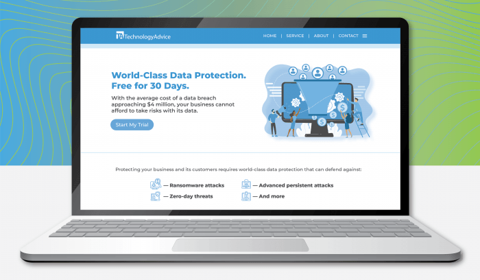
1. Keep the design simple
Today’s audiences are bombarded with messages, which means they are more likely to skim than to read. Your landing page can appeal to skimmers and readers alike by using bullet points for text, employing plenty of white space, and eliminating navigation elements that detract from the message and make it easy for readers to go elsewhere.
Everything that appears on your landing page should focus on your offer. This isn’t the place to discuss your product portfolio or company history. Whether you’re offering a downloadable asset or a trial, focus solely on what the visitor will get from completing the requested action. Stick to one option — either a download or a trial — to encourage a quick reaction from your reader.
ALSO READ: 7 Common Pitsfalls Enterprises Make in Their Content Marketing Strategy
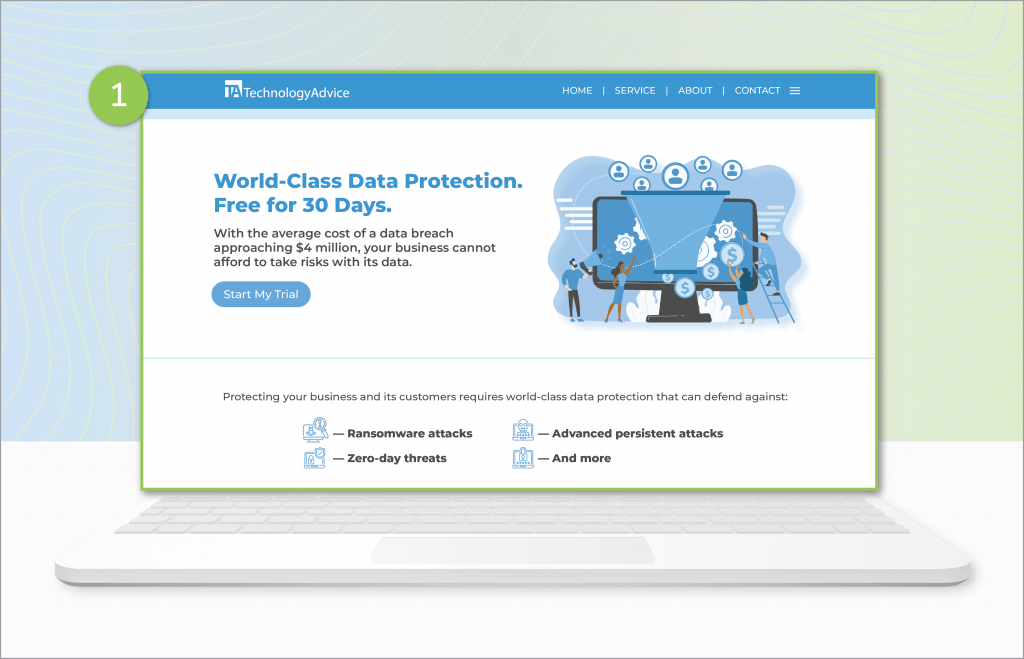
2. Use a clear, compelling headline
Your headline should focus on how the reader will benefit from taking the desired action.
Get a 30-Day Trial of Our Security Software
This is a clear headline, but it’s not as compelling for the reader as
World-Class Data Protection, Free for 30 Days
This headline speaks to the quality of the solution (world-class), what it does (data protection), the price (free), and the duration of the offer (30 days).
3. Use clear calls to action

Direct your readers to your call to action (CTA) by using a button that distinguishes the CTA from everything else on the page. Why? Your CTA is the most important element on the page. Your call to action should always be “above the fold” so readers don’t have to scroll to find it. If your page does scroll, then a second button at the bottom for readers who make it down the page is a good idea.
If your offer is a download or a free trial, label the button appropriately so readers know exactly which action they are taking.
4. If at first you don’t succeed, optimize your landing page!
The ability to measure the performance of landing pages and optimize them to improve conversions is one of the great things about digital marketing. It simply wasn’t possible for marketers working with print and television ads to do this without a significant investment in time and resources.
A/B testing will help you optimize your landing pages. Simply put: deploy two pages for the same offer and see which one performs better. But be forewarned: paralysis by analysis is real, and too much tweaking and testing can detract from your mission. There are a lot of variables at play. You will not find a headline that appeals to everyone who visits your page. Different colors will appeal to different people.
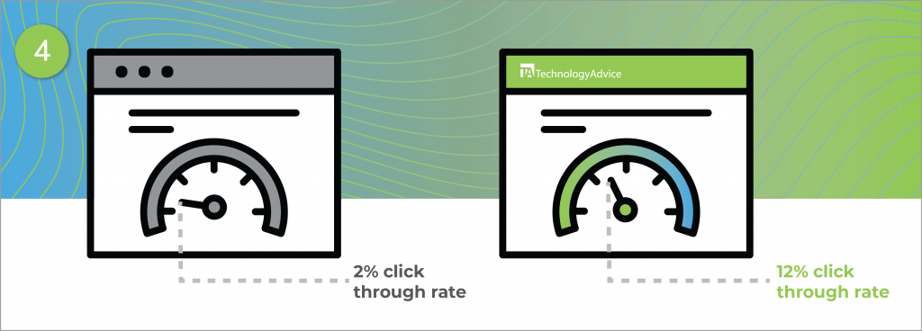
In our own experience at TechnologyAdvice, we’ve used several different A/B testing tools including VWO, Google Optimize, and Convertize to improve our landing page conversions. Through many iterative A/B tests, we found two of the most effective changes involved changing the placement of a website widget and changing the color of the CTA button. These changes improved our conversion rate by 12 percent. It will likely take time and resources to reach conclusions like these, but it’s well worth the effort for the boost to your bottom line.
Your goal isn’t to appeal to the whims of every single visitor. It is to find the right combination of design, copy, credibility, offer, and CTA that converts the most visitors into leads. You’ll only develop a sense of what’s working if you test and optimize.
TechnologyAdvice can help you drive traffic to your optimized landing pages with our Intent Clicks program, which puts your solutions in front of buyers actively researching products like yours.