

Anyone who’s ever driven a car knows the role of the dashboard: provide you the most critical data you need right now for the task at hand, and nothing else. The dashboard metaphor has also taken hold in business applications. Instead of displaying the car’s status, it displays data generated from business activities, marketing surveys, sales numbers, etc., to aid informed decision-making.
The dashboard is simple for a reason: you don’t have time to decipher complicated information or overwhelming indicators when making critical decisions. The same is true for a business dashboard. Businesses and organizations need dashboards to improve the decision-making process in a short time. The biggest challenge in creating business dashboards may be to approach them with the same kind of on-a-need-to-know-basis set of gauges.
That said, assuming you have some idea of what data to show, the implementation of a dashboard is not rocket science.
In this tutorial, I will share with you some tips to build an effective dashboard regarding the final use of the dashboard.
Let’s get started 🙂
1.Separate background from the charts
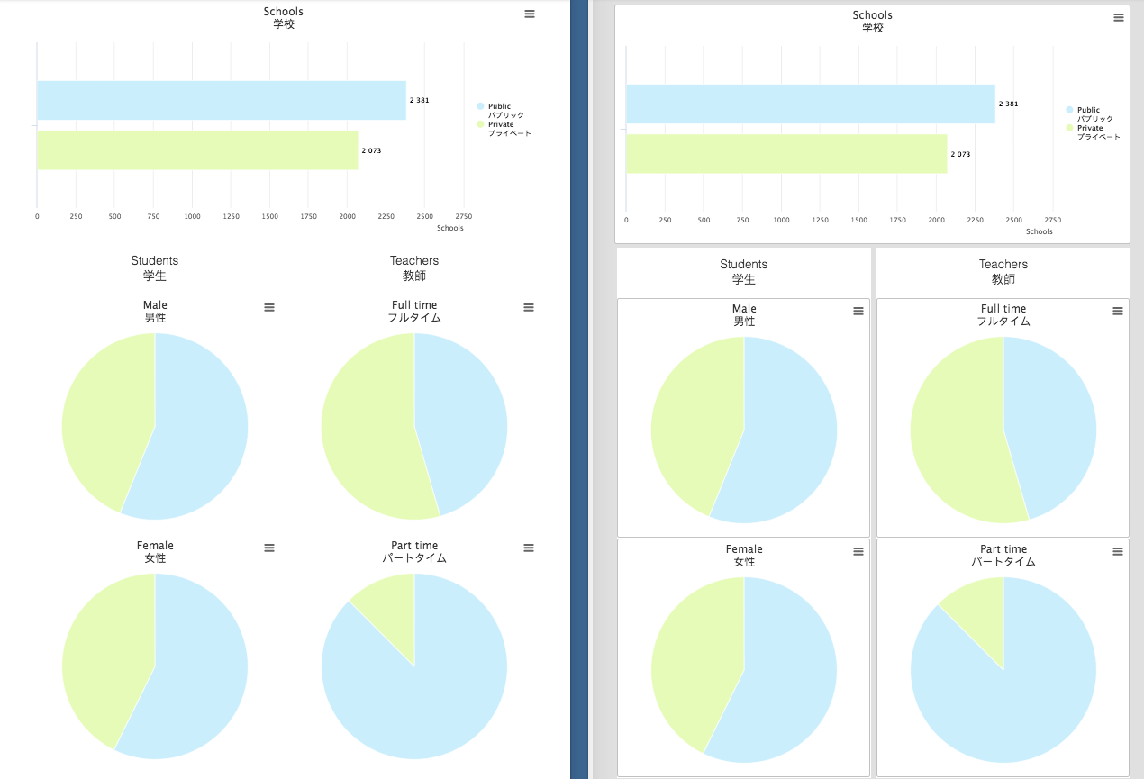
I will start with this basic common sense tip, even though it may seem obvious and superficial. First impressions matter: If the background is not visually different from the charts, users could be easily confused, spending the first few seconds to figure out the charts’ borders and content before trying to understand the purpose of the dashboard.
To help users spot the different charts quickly, make sure each chart has a border (or different background color from the outside canvas.) The picture below visualizes two dashboards, where only one applies this principle. Judge for yourself.
2. Know your audience
Dashboards are meant to help users, and must be customized to your audience needs, interests, level of expertise, and analytical ability.
Also, pay attention to factors such as the audience’s culture and cognitive or physical disabilities that require special considerations.
Let’s look at some examples of how knowing your audience can help you prepare better dashboards:
a. Culture
In the western world, the colors green or blue are used to represent prosperity, whereas the color red is used to show the opposite; while in China red is used to represent success. So pay attention to the use of the right color (or get fancy and vary them by region).
b. The level of expertise
If the audience is senior executives, forget the nitty-gritty details (not because they can’t understand them, they just don’t have the time!) Use simple column, bar, and line charts, as they are easy to understand. But if you are dealing with experts, feel free to add details, and to use advanced charts to provide opportunity for data exploration.
The dashboard below features some simple executive chart examples.
http://jsfiddle.net/mushigh/bt6hf5cq/show
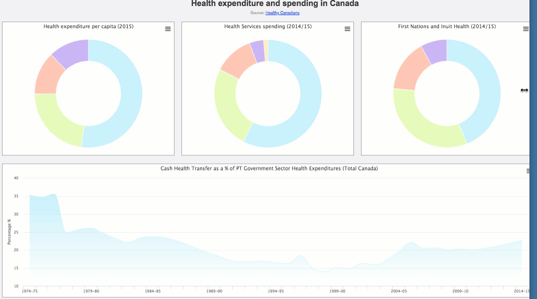
c. Accessibility
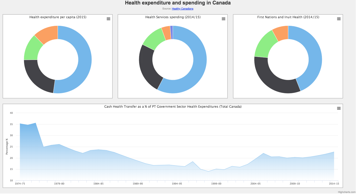
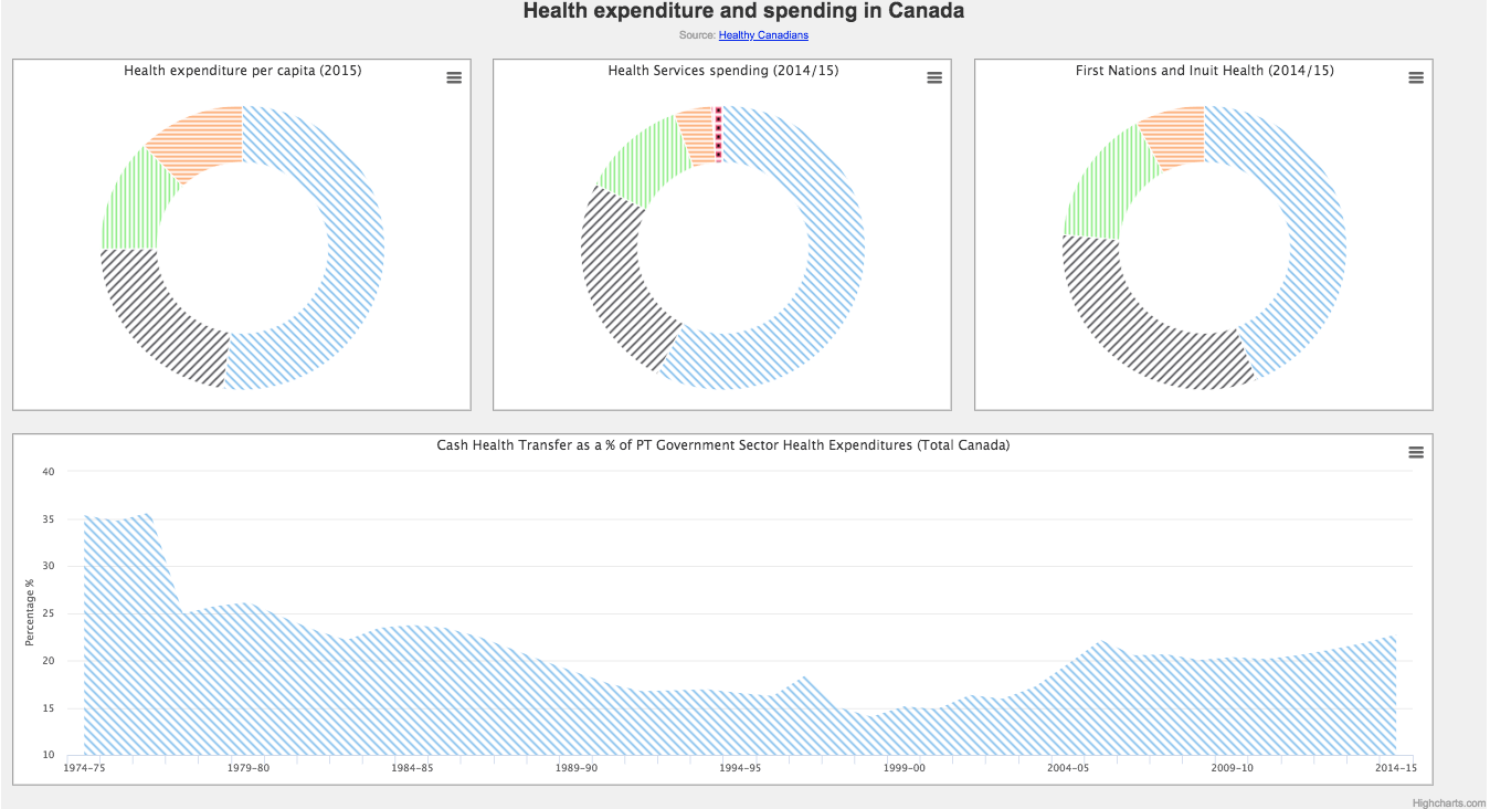
According to the color blind awareness organization, color blindness affects up to 8% of men and 0.5 of women. Chances are, part of your audience is color blind. Thus, use patterns instead of just colors whenever appropriate. Below is an excellent example of a dashboard with patterns to visualize the health expenditure and spending in (Oh) Canada(!):
http://jsfiddle.net/mushigh/uvpzmL5k/show
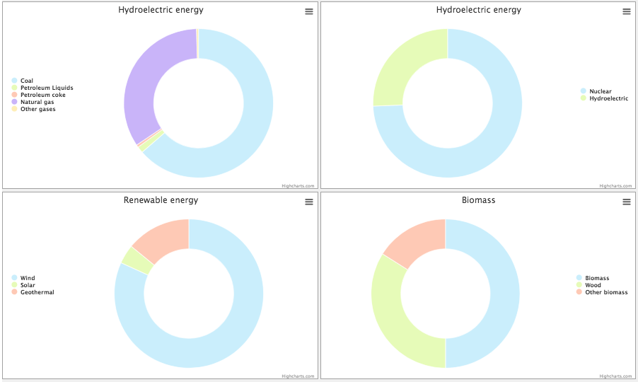
3. Keep the legend close to the charts
A legend is one of the critical elements in a chart since it helps to decipher what the chart tells the users. So always use the right legend’s words to describe your chart. But, this is not the only thing you should care about when you use a legend, you should place the legend as close as possible to its chart and far from other charts to avoid any users’ misinterpretation. For instance, the dashboard below has four charts, and each chart has its legend in the middle left or right position; in this case, there is no room for misinterpretation as it is obvious which legend belong to which chart.
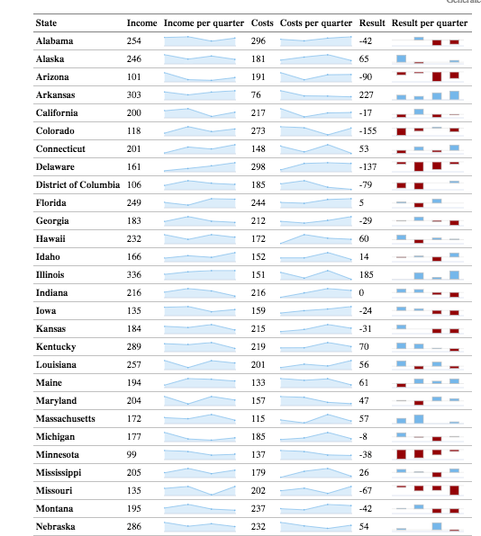
4. Avoid crowded charts
Most people make irrational decisions when presented with too much information at the same time; this phenomenon is referred to as information overload or infobesity. The best way to prevent information overload is by breaking down charts into simple charts.
For instance, the dashboard below visualizes the income and cost for each state in the USA separately. I will let you imagine how messy it would be if all the charts are displayed in one chart, it would be impossible to come up with any decision or conclusion.
https://jsfiddle.net/mushigh/amfxrt7q/
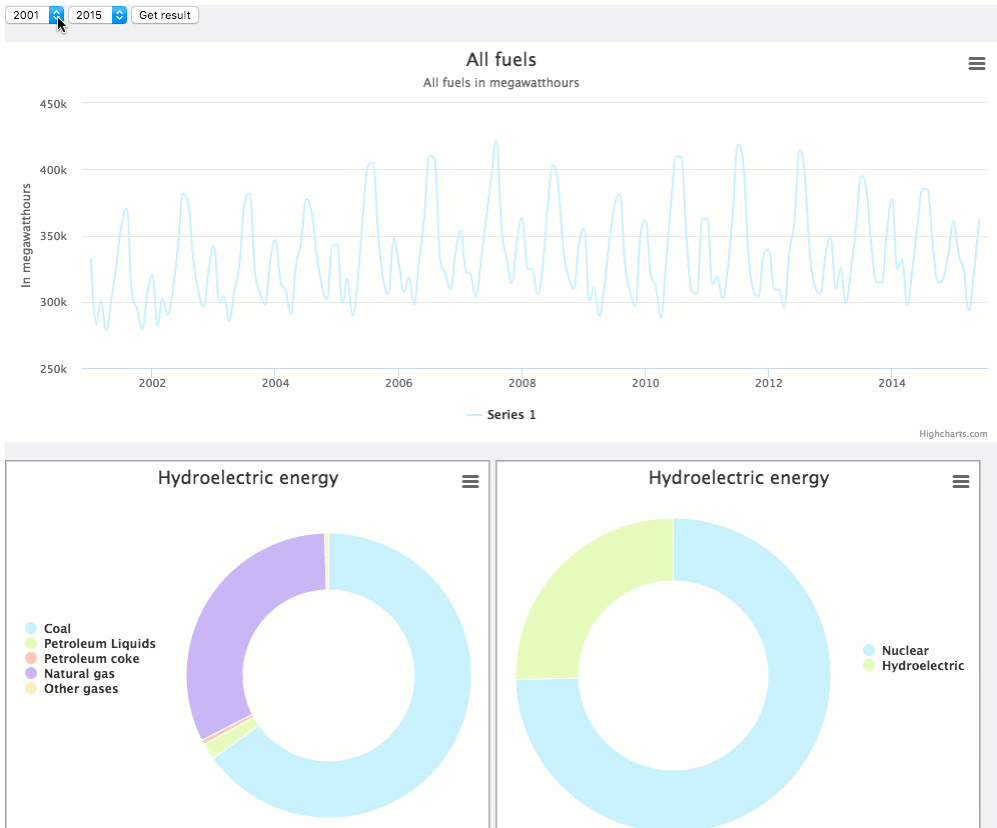
5. Provide tools to explore data
Interacting with dashboards is an excellent way to explore data and come up with a better conclusion and decisions. So provide your audience with interactive features such as zooming and filtering, as they are intuitive and easy to use (see animation below):
6. Think responsive design
It goes without saying that a responsive design, in general, is a must; your dashboards need to be user-friendly on smartphones and tablets, as users use all kind of devices and screen sizes (see animation below):
Summary
Dashboards are a great tool to display multiple charts on one big display. Keep in mind that the goals of dashboards are:
- To empower the users to explore data and come up with their own ideas/decisions.
- To share insights using pre-selected data and charts. Be sure to provide an easy to read dashboard to reduce the probability of confusion and to maximize your chances to achieve your goal.
I will be happy to hear about your experience with dashboards, so feel free to share any other tips that help to make a better dashboard.
Mustapha Mekhatria is a community manager at Highsoft located in Norway. Follow him on Twitter and LinkedIn to find more blogs and demos about data visualization.
Ready to pick out the best BI software for your business? Click on the image below to get fast, free recommendations via email, or visit our business intelligence page to browse reviews, recommendations, and advice on your next BI software.
Top Business Dashboard Software Recommendations
1 Domo

Build a modern business, driven by data. Connect to any data source to bring your data together into one unified view, then make analytics available to drive insight-based actions—all while maintaining security and control. Domo serves enterprise customers in all industries looking to manage their entire organization from a single platform.
Get our best stuff.
